Branding
CASE STUDY / 01 / HALO Branded Solutions Rebrand
OBJECTIVE /
HALO is the global leader in branded merchandise industry, yet the brand identity and messaging strategy did not accurately reflect this. The logo was outdated and we needed to enhance and elevate the messages we communicate to our clients and prospects about HALO.DELIVERABLES /
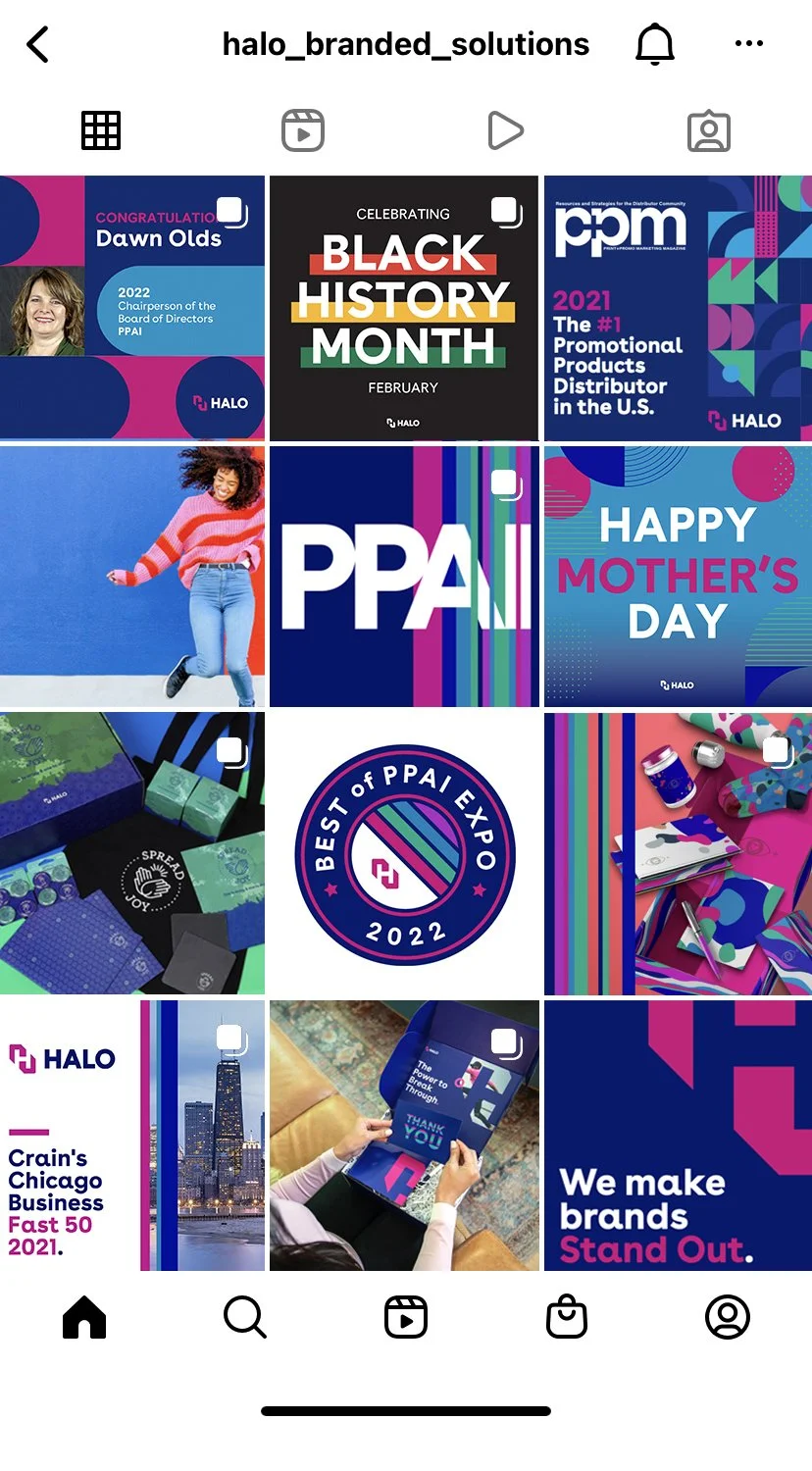
I was responsible for the overall visual and creative needs of the brand. I was tasked to lead the rollout of our visual language across all critical touchpoints. I identified scope and plan, and successfully led the creative executions team to transition all internal and external documents by developing an inventory list and design workplan.Brand Guidelines / Brand Assets / Marketing Materials / Presentation Templates / Web Design / Branded Product Designs / Photoshoot Art DirectionSTRATEGY /
• Identified required steps for the launch - Set timeline and milestones - Set work groups - Set expectations• Reviewed research, brand strategy, and platform• Logo and visual identity reveal




CASE STUDY / 02 / Outdoors For All
OBJECTIVE /
Founded in 1979 in the Pacific Northwest, Outdoors for All is a national leader in delivering adaptive and therapeutic recreation for children and adults with disabilities. Outdoors for All enriches the lives of individuals with disabilities and families and helps them to get out and enjoy the great outdoors. Formally known as Ski For All, as they expand their programs to not only skiing but also various activities including snowboarding, cycling, kayaking, hiking, military programs and other custom events, they needed an overall brand makeover to match their mission. DELIVERABLES /
Brand RefreshLogo DesignMarketing Materials
STRATEGY /
Creating brand mark that is all-inclusive with modern look and feel was essential. It needed to work for different applications in various sizes and imprint areas. I was able to create a logo and brand that is memorable and easy to implement by various teams like volunteers, vendors and consultants.


CASE STUDY / 03 / Bye Bye Fruit Fly
OBJECTIVE /
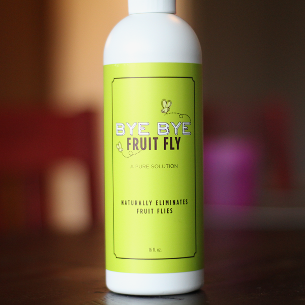
Bye Bye Fruit Fly is an earth-friendly solution made with sustainable, natural ingredients that is safe for kids and pets. It’s a newly developed product and the founder needed a logo and bottle design to start marketing in wholesale and retail.DELIVERABLES /
Market ResearchLogo DesignIcons and IllustrationsPackagingVarious Marketing MaterialsPromotions
STRATEGY /
I wanted to create a brand that is unique and colorful, and stands out in retail shelf space, as there is no comparable product in market place. Custom illustration and hand-drawn style of font add character to the overall look that separates from other similar products in market.


CASE STUDY / 04 / The Pokémon Company International
Licensing Division Holiday Ornament and Packaging
OBJECTIVE /
Design and develop holiday ornaments and packaging based on Pokémon’s four most popular characters. They were to be sold at retail stores during holiday shopping time.DELIVERABLES /
Market ResearchLicense ManagementProduct DevelopmentPackagingLocalizationRetailer Specific EDI CompliantConcept & DevelopmentPOP, Endcaps & Other Floor Displays
STRATEGY /
Pokémon is one of the most beloved brand globally. With their strong brand compliance and fan base it is no small task to create products with the characters. It was critical that we follow their strict brand guidelines and pay close attention to details, while creating packaging that is unique and stands out in retail shelf space.Our expertise with custom product development, social compliant manufacturing practices and product safety has provided great value to our retail clients – mass and boutique.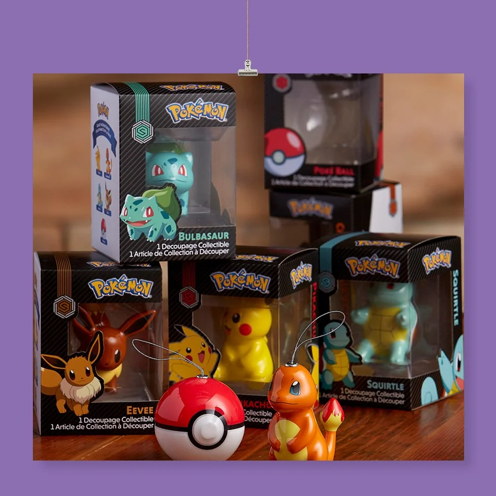


CASE STUDY / 05 / F45 Training Branded Gear and Apparel Designs
OBJECTIVE /
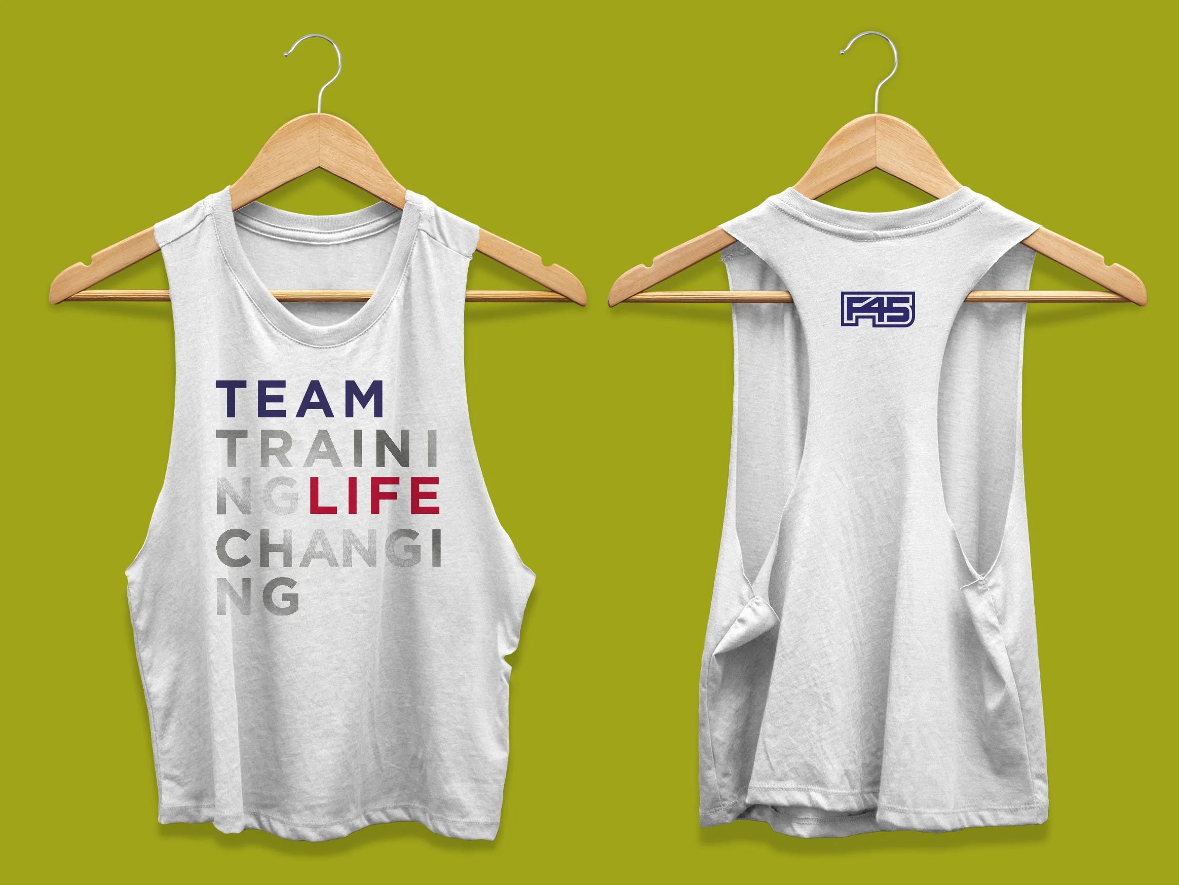
F45 is a community brand, not just a place to go workout. They approached us to create a line of branded apparel for trainers and customers to wear while working out, posting on social media to show off their gear, their lifestyle, their workouts, and their personal image. DELIVERABLES /
Market ResearchProduct Merchandising & DesignStore PromotionMarketing Materials
STRATEGY /
Their audiences are social influencers who are actively posting with F45 gear on social media. I wanted to offer creative and trendy products that they are proud to wear and share on social to increase brand awareness and drive sales. Extensive market and trend research was done to ensure our design offerings were on point and fashion-forward, while unique to their customer base. We experimented with various logo placements, printing techniques and custom graphic explorations.



CASE STUDY / 06 / T-Mobile Branded Gear Program Employee Online Store
OBJECTIVE /
We run every aspect of the online branded gear program for T-Mobile employees and company fans, from the platform to inventory. They are looking to refresh their employee program site and create a line of branded apparel for the online store.DELIVERABLES /
Web Store RefreshProduct Merchandising & DesignStore PromotionMarketing Materials
STRATEGY /
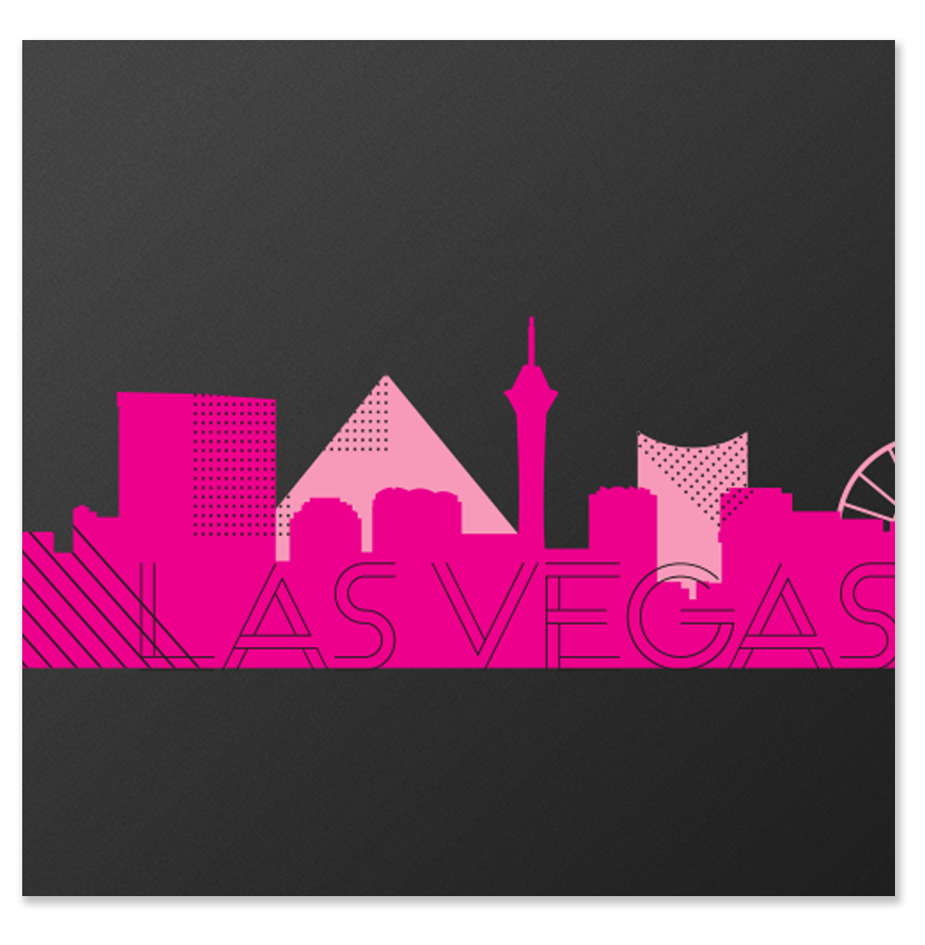
The website and products needed to feel fresh and new, incorporating their signature color - magenta. Each piece reflects the brand, audience, and their buying habits. They were also opening new flagship stores in six cities so they needed retail merchandise designs that reflect their brand. I created custom designs with cityscape art along with specific products matching each city, that are unique and on brand.


CASE STUDY / 07 / AWS re:Invent Workshop App Design
OBJECTIVE /
AWS re:Invent has become the place for the AWS Cloud community to meet each year and look to the future together. The workshop shows attendees how to build a Progressive Web App (PWA) using the Bootstrap framework for layouts that helps theme park attendees navigate a fictitious park. They needed a theme park logo and various graphics to support a number of elements within the workshop.DELIVERABLES /
Park LogoMap DesignIcons and IllustrationsSupporting Graphics
STRATEGY /
To create an unique workshop experience for attendees, we wanted to develop fun and whimsical environment with custom logo and supporting graphics, including retro amusement park vibe. We collaborated with their App developers and all assets had to be produced with specific format and guidelines that would work with the application. As a result the workshop was engaging, entertaining and we had a high participation rate.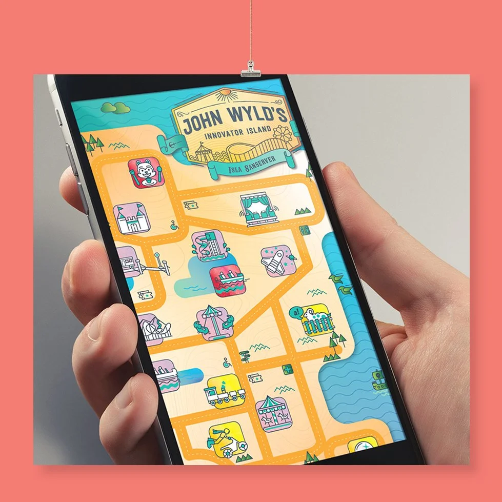


CASE STUDY / 08 / University of Phoenix Web Store Product Designs
OBJECTIVE /
University of Phoenix provides a career-relevant and affordable education that fits their life. Most students participate online offering higher education certifications for working adults. As a part of their brand refresh and initiative to enhance quality of student enrollment experience they were looking to add new and innovative product line and web assets to their online store.DELIVERABLES /
Web Store RefreshMarket ResearchProduct Merchandising & DesignStore PromotionMarketing Materials
STRATEGY /
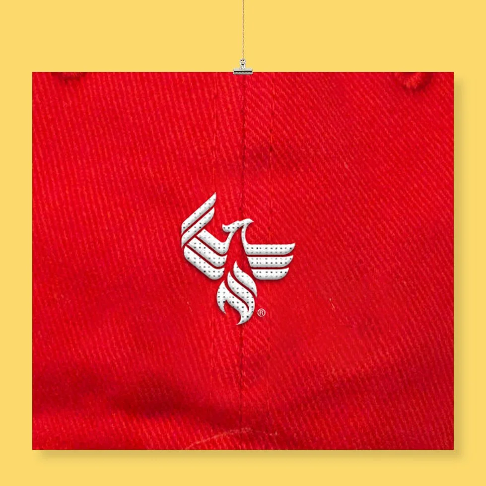
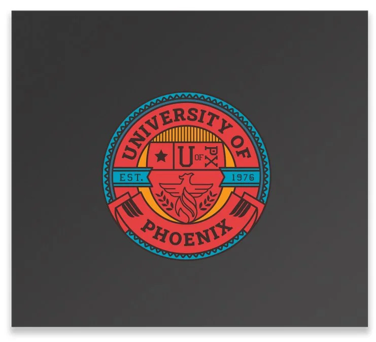
They needed help with creative and taking products to new level. I wanted to create a line of merchandise that is stylish with retail look and feel, from college-retro to trendy, specifically branded for University of Phoenix students and alumni. We were expected to push envelope with proactive and creative approach, giving as many ideas as possible. They implemented and produced many of our product designs. We successfully improved the store quality and sales went up after the refresh. We also worked with their digital team to design store merchandise to coincide with their social communications.